The Schist Village Network comprises 27 villages located in the center of Portugal, in a territory of 5,000 km2, divided into four territorial units: Serra da Lousã, Serra do Açor, Zêzere, Tejo-Ocreza. The rebranding project covered all areas of the identity.
communication e storytelling
brand environments
sign
communication e storytelling
brand environments
signage
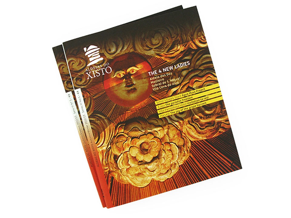
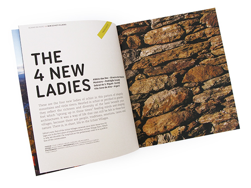
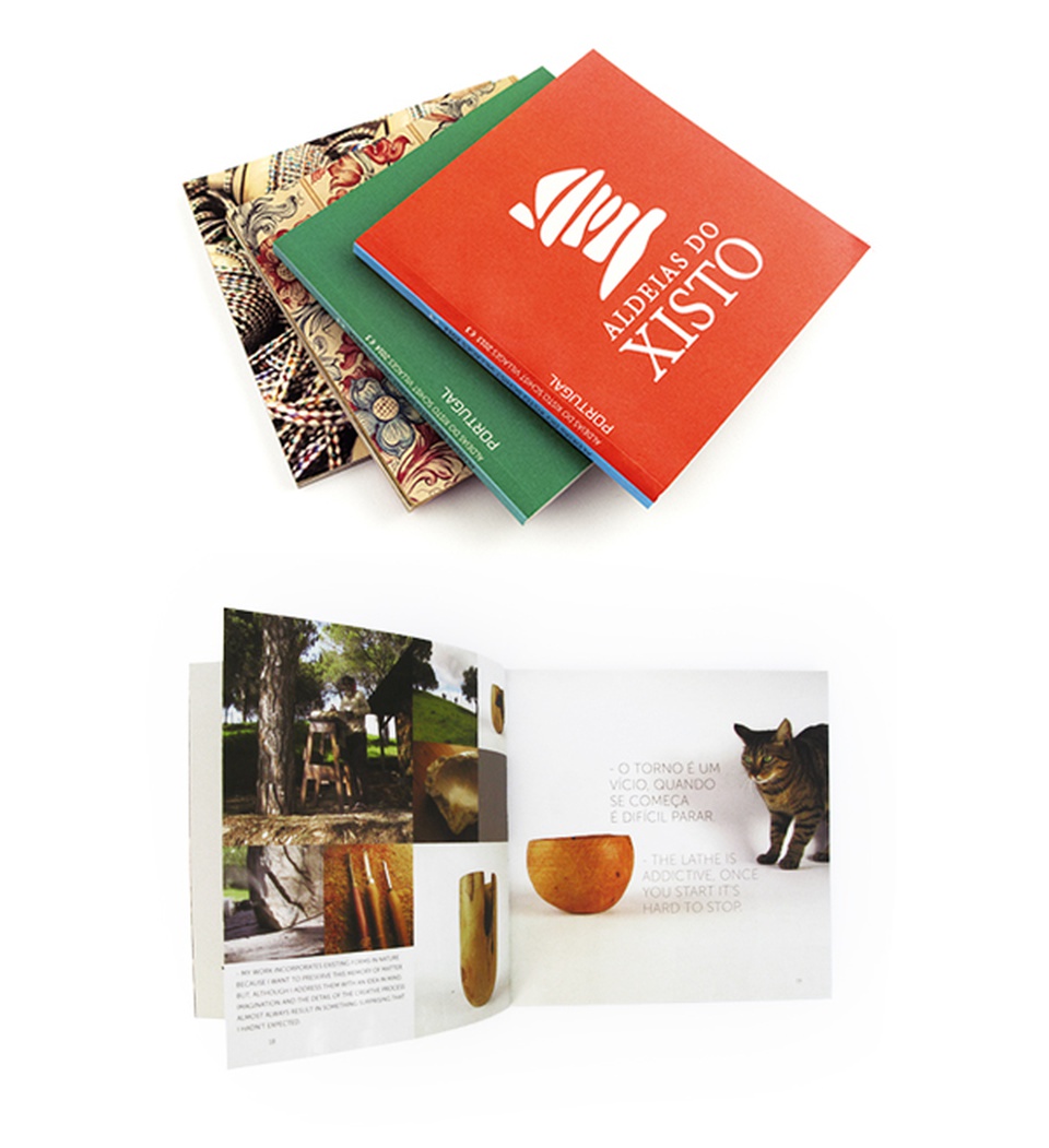
corporate brochures
ads
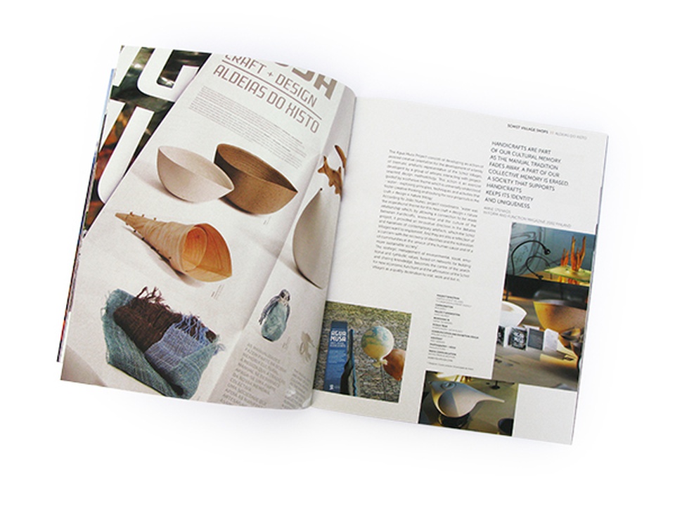
merchandising
digital communication
corporate presentations
PROJECT
- rebranding aldeias do xisto
DESIGN
- atelier nunes e pã
DESIGN CONSULTANT
- joão nunes
COORDENATION
- bruno ramos, rui simão, adxtur
- - agency for the tourist development of schist villages
In the Aldeias do Xisto brand, the symbol represents a house and signifies inhabited space, belonging, community, preservation, and sustainability. The letter "X" embodies the concepts of multiplication, interaction/crossing, place, and choice. The layers associated with schist represent plurality, diversity, and resilience. These are the guiding principles of the structural basis for the current rebranding. The symbol was redesigned from the previous brand created by designer Rui Martins, becoming more angular, like schist stones. The black colour in the current rebranding was chosen to represent the hard consistency of the schist stone and the solid resilience of the local population.
The grid serves as the basis for the construction of the Brand and Sub-Brands and for the articulations between the visual elements of the universe of the Aldeias do Xisto Brand. It allows the component elements to be moved, in order to obtain a dynamic, coherent language that cuts across all media. The Brand is based on geometric shapes drawn from the matrix. The Logo is built with the Epura Bold typography created by the designer Luis Bannovas for NovaType Foundry, with the exception of the letter X in the word shale, which is built on the diagonals of the square.
The letters combine to create multiple meanings. Letters, transformed in words, they come together to carry the memory and fill with meaning allowing transmit thoughts and interpret others. For the Schist Villages we selected words in harmony with the values of the territory, which come wrapped in the states emotions that we find there. We build combinations with selected words, which we called ”Guidance Words”, using the X to multiply them.
Pictograms serve to inform and represent things and objects in the surrounding environment, products, animals, actions or abstract ideas, among others. Pictograms, when organized in a sequence, create an image language that we call: Schist Villages Pictographic Writing
The Schist Villages are a Brand of a strong incubating nature with a profile catalyst for products, projects and services integrated by the community. The application and understanding of your brand by peers and the public is the focus of the Identity Manual from the Schist Villages brand. It is a guide that shows how to fulfil the graphic and visual codes of conduct for creation of a mental image of the Brand.
The presentation event to the community and partners took place in one of the natural settings, the village of Fajão, hosting music and performative actions and also the launch of the website.
PHOTOGRAPHERS
- adriana oliveira, bernardo conde, bruno ramos,
carolina serralha, diogo tavares,
jacc - jazz ao centro clube, joão nunes,
joão margalha, miguel claro, miguel proença,
pedro martins, tiago cerveira
TYPOGRAPHY
- epura, nova typefoundry
TECHNICAL REDACTION OF THE BRAND BOOK
- luísa do valle, sandra antunes
WEB DEVELOPMENT
- queo
MUSIC FOR THE PRESENTATION VIDEO
- jacc / slow is possible