The redesign of the “Fragulho” wine labels is part of the brand’s project, which deals with products and experiences linked to the Earth and what can be enjoyed from it. The labels embrace the wine, a testimony of time and memory. These are the “roots that bear fruit”, the motto of the project, a reference to the family and their stories.
labels
product packaging
PROJECT
- fragulho wines labels ans packaging
DESIGN
- atelier nunes e pã
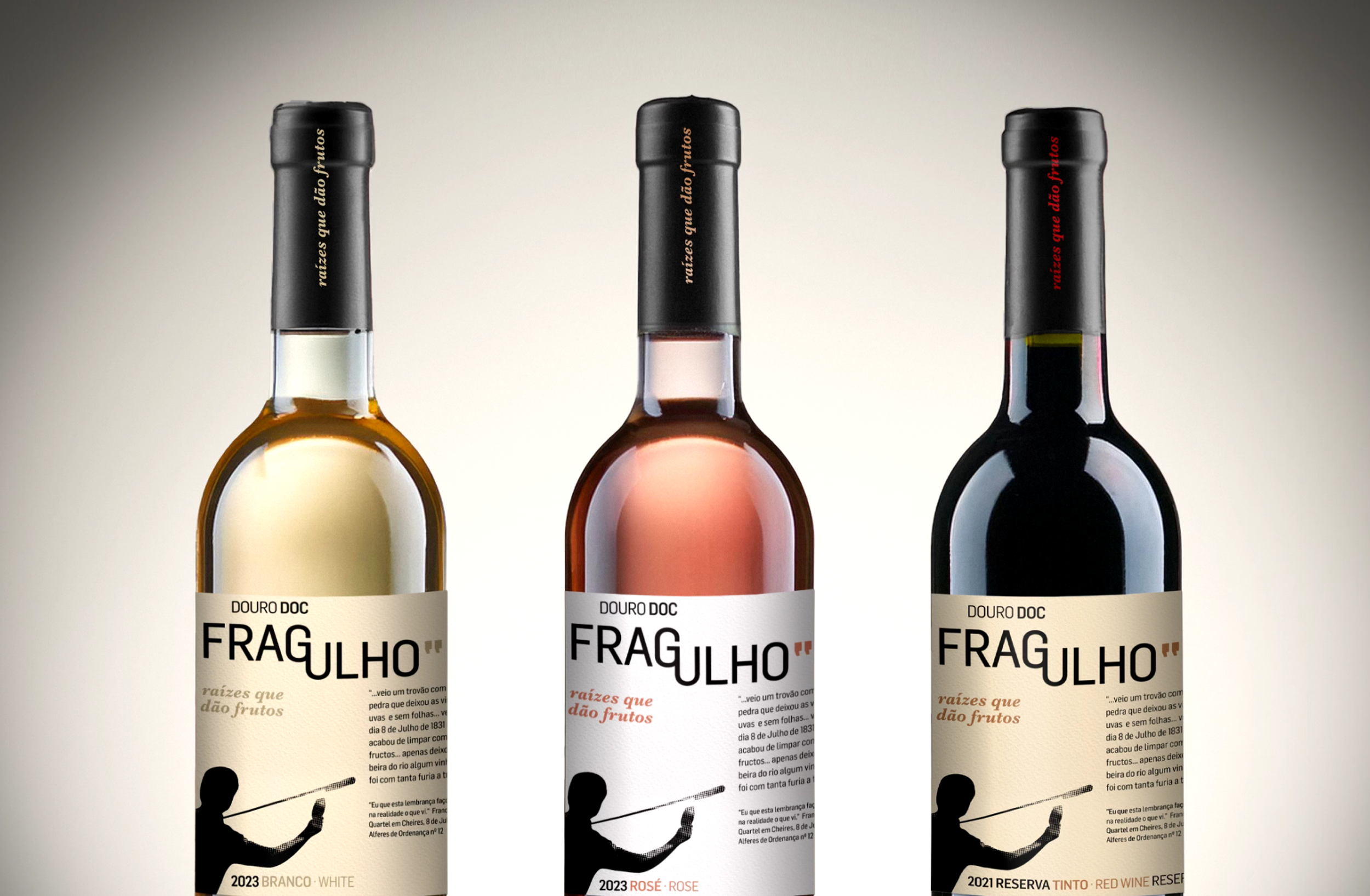


The geographical region in which it is located, the Douro, significantly contributes to the brand's personality—strong and enduring, like the terraced slopes where the vines have resisted for years. A close connection with the stories and memories of the people and places enriches the brand’s visual and tasting experience.
The logo design connects two concepts: the terraced vineyards, present in the Douro landscape, and the reference to communication and the citation of past generations, represented by quotation marks. The labels refer to the moment when humans make history through the act of tasting wine, using an object they themselves have created.


The design of the Moscatel (350ml) boxes was developed with the goal of showcasing the wine and its color, functioning as a display box while also optimizing storage and transport. A message engraved on the inner wooden lid, which secures the bottles, is revealed in the first moment of interaction.