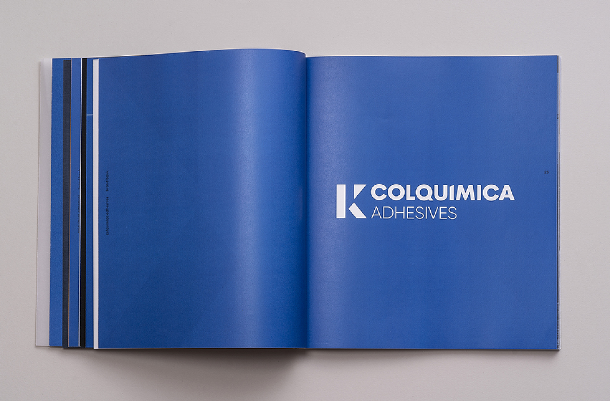
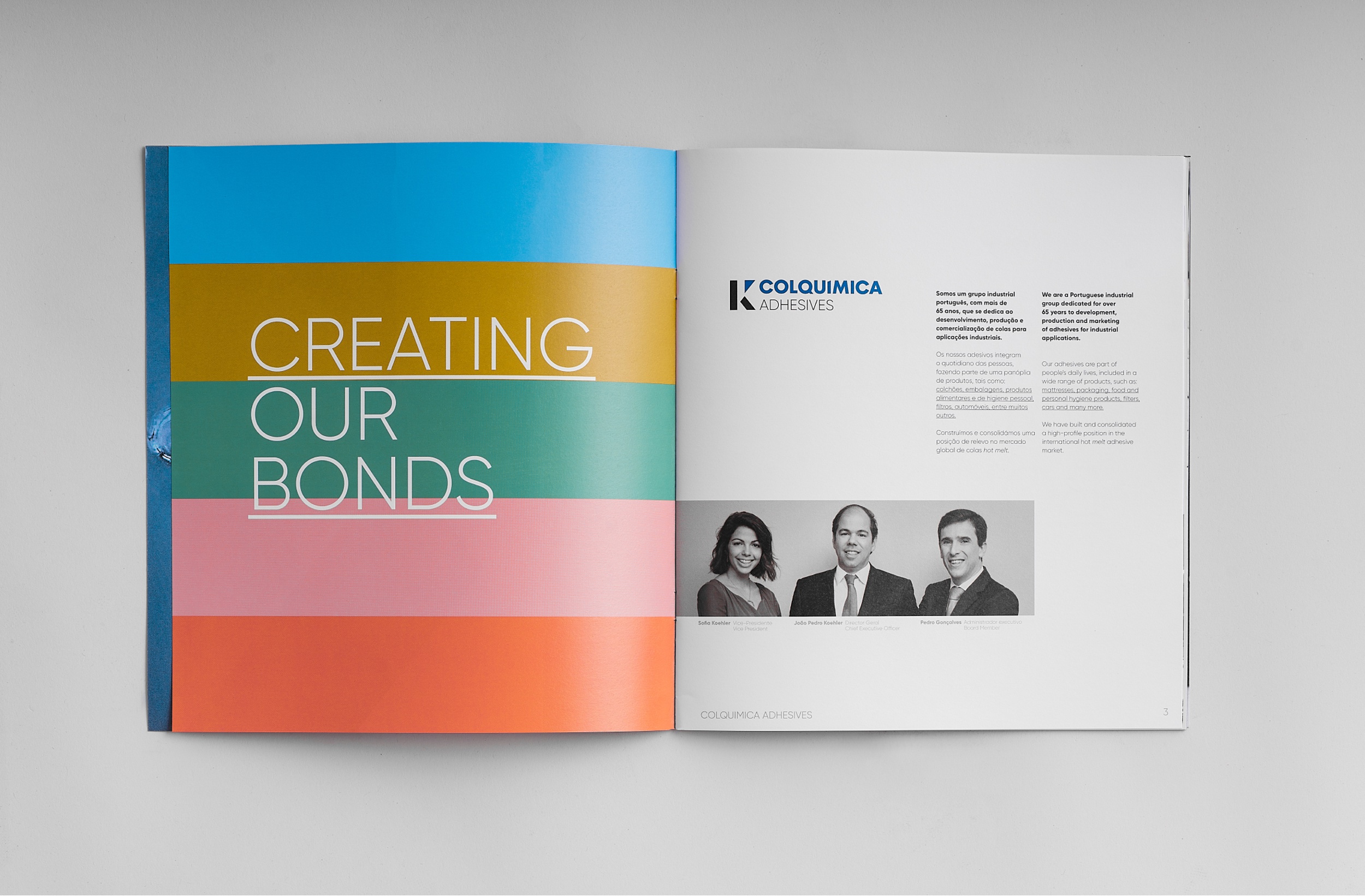
Colquimica is a Portuguese Group that operates worldwide in the development, production and selling of hot melt adhesives for several markets of industrial activity.
The goal was to communicate the brand’s new corporate dna as well as its legacy, exploring the growth potencial, leading it towards the future.
design
corporate identity
communication and storytelling
naming
web design
corporate brochures
corporates presentations
product packaging
PRODUCT PHOTOGRAPHY
- nuno teixeira
CORPORATE FILM
- um segundo filmes


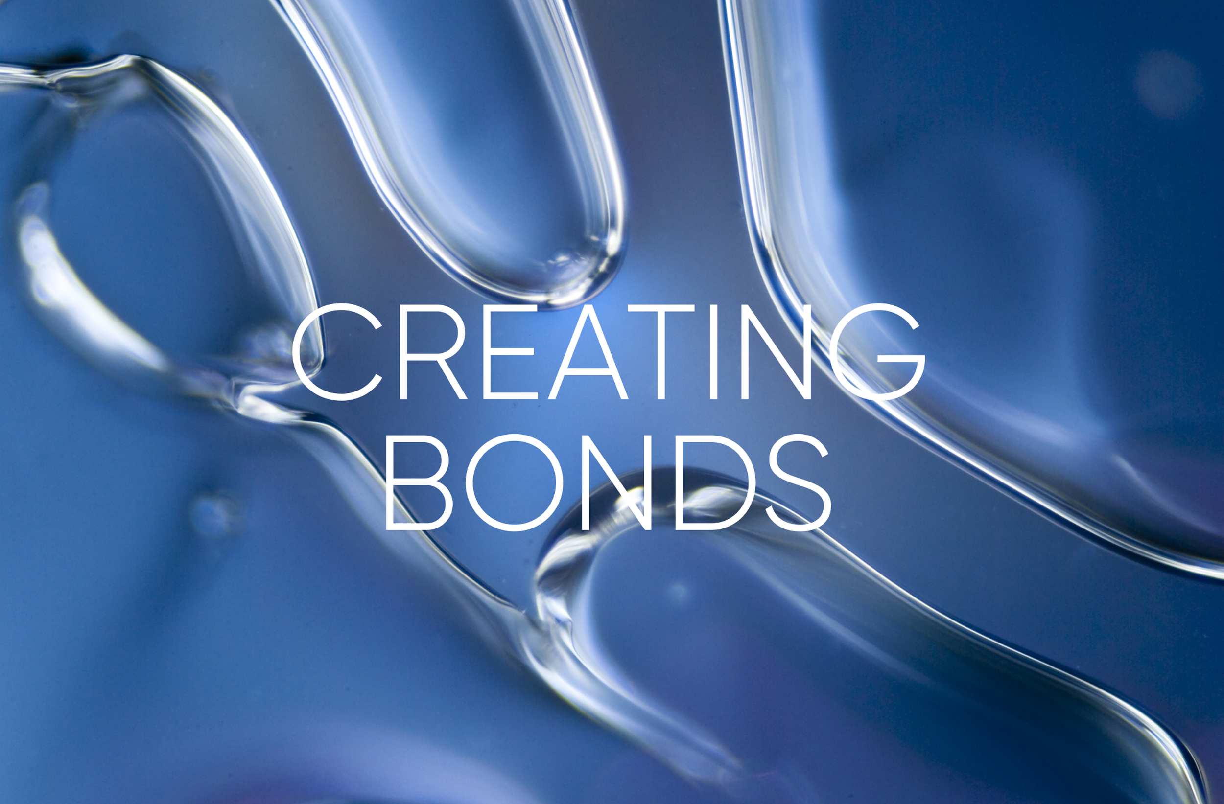


DNA, Brand moto & Brand visual universe
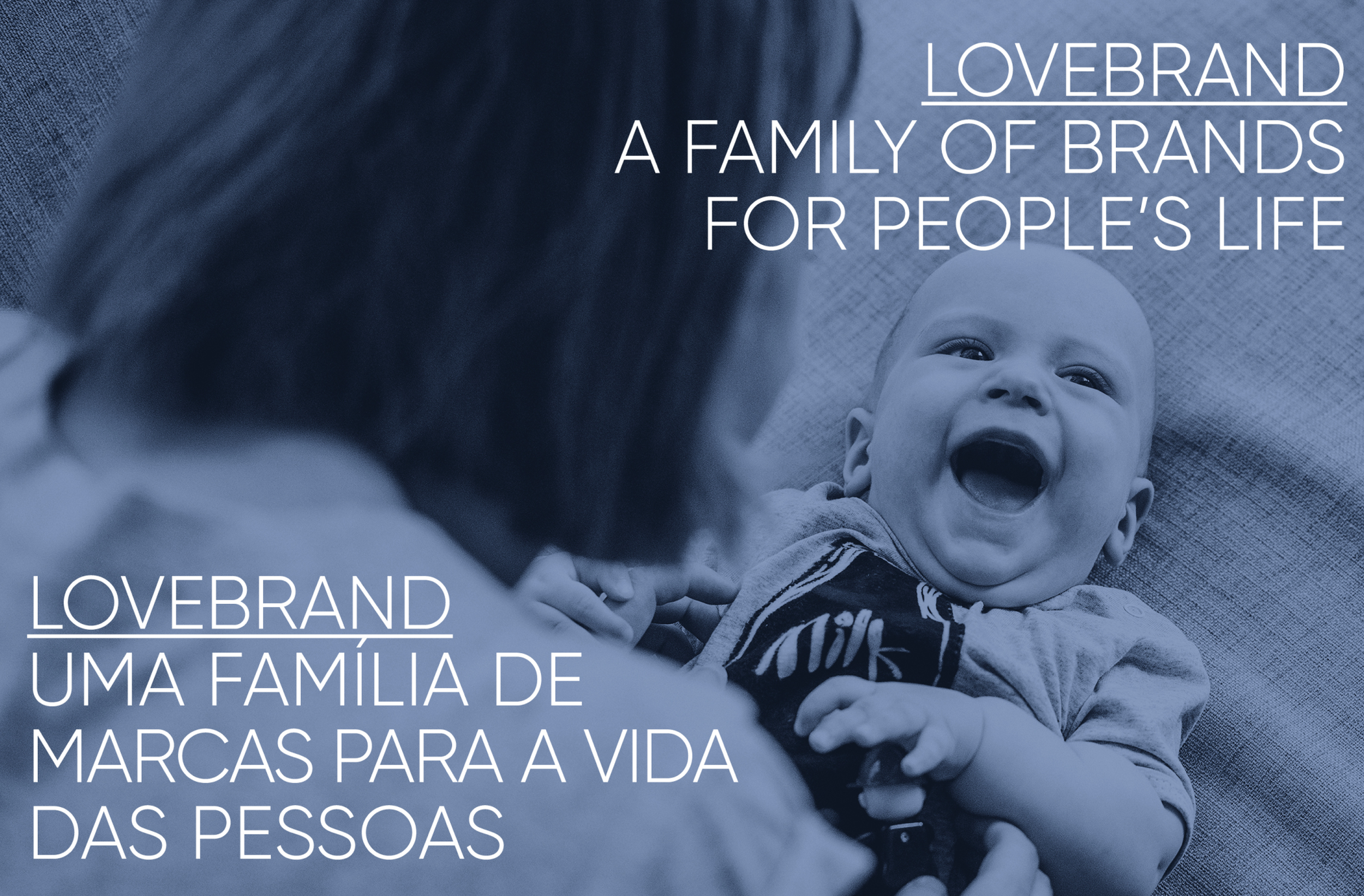
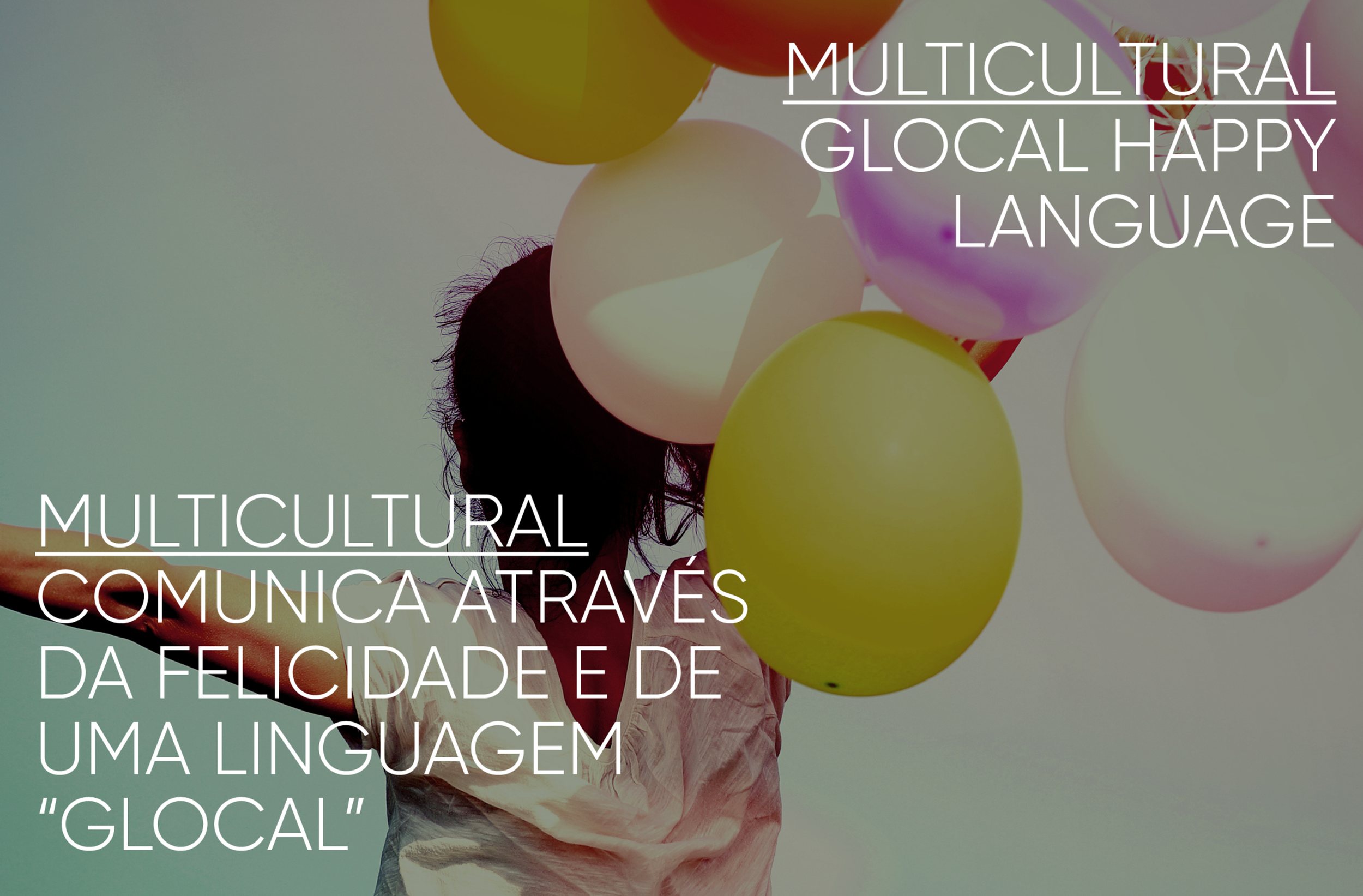
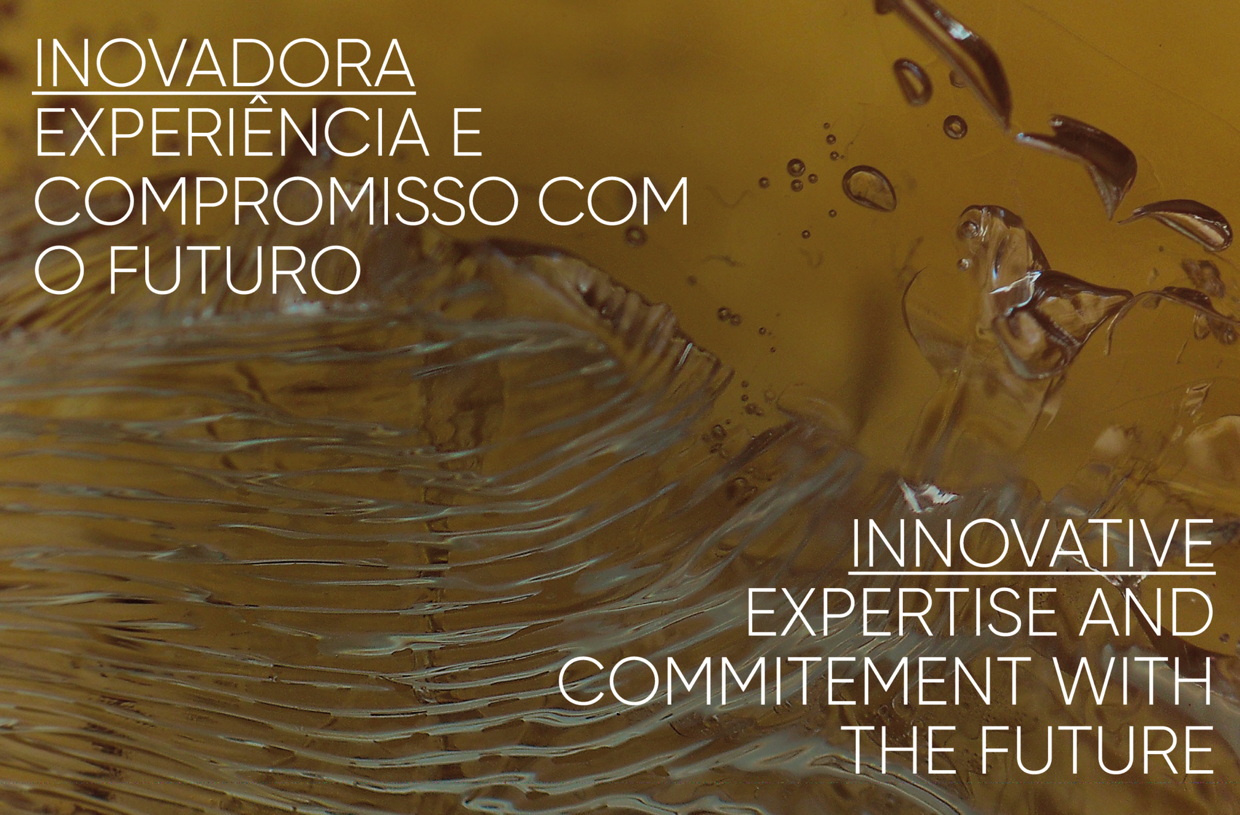
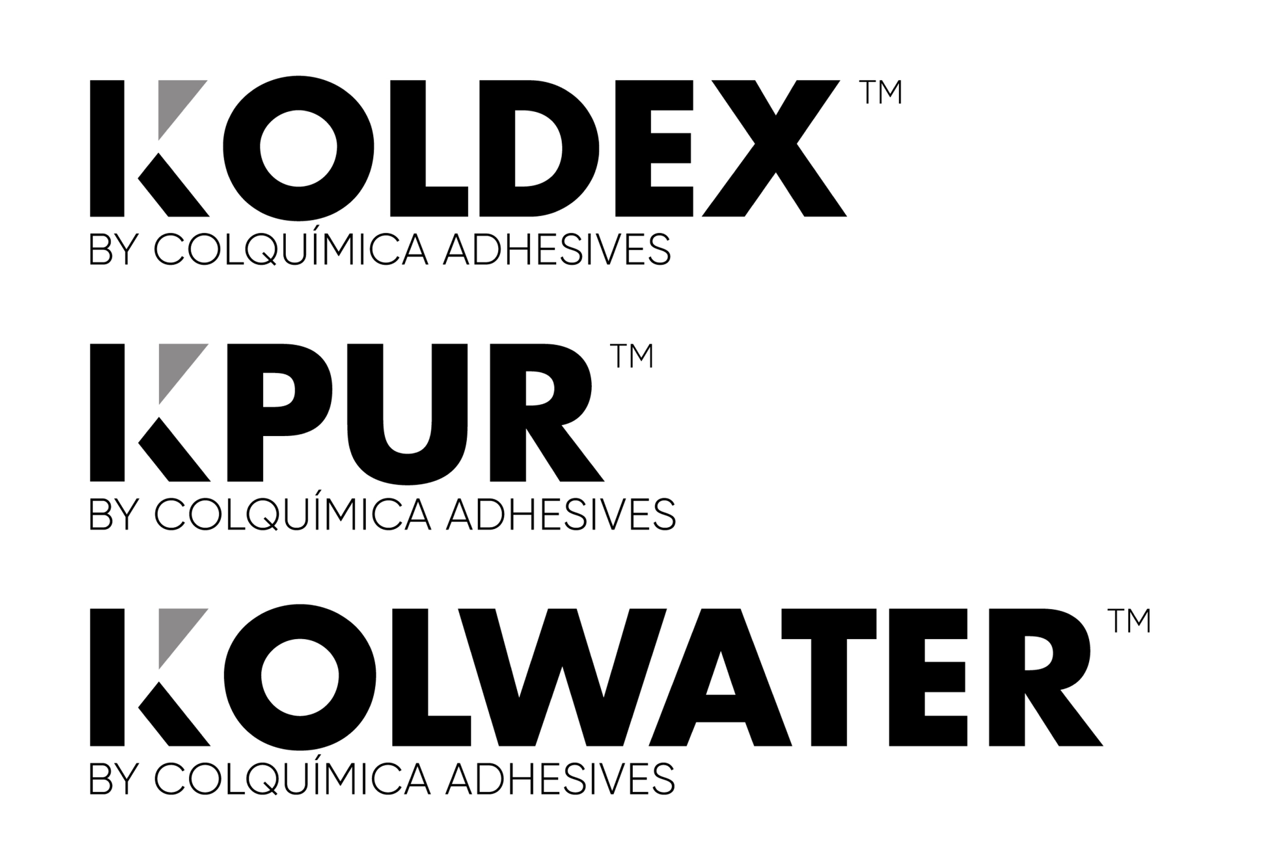
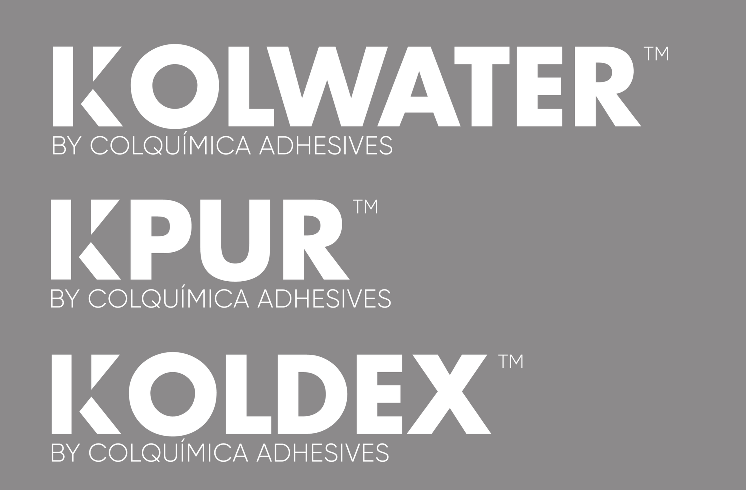
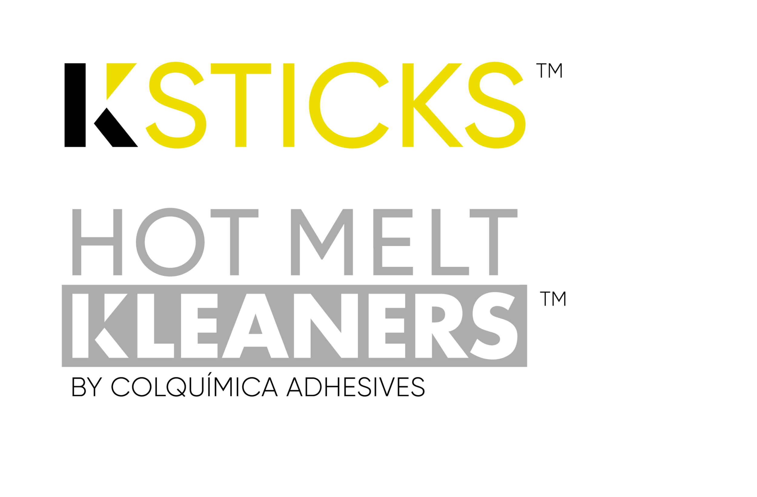
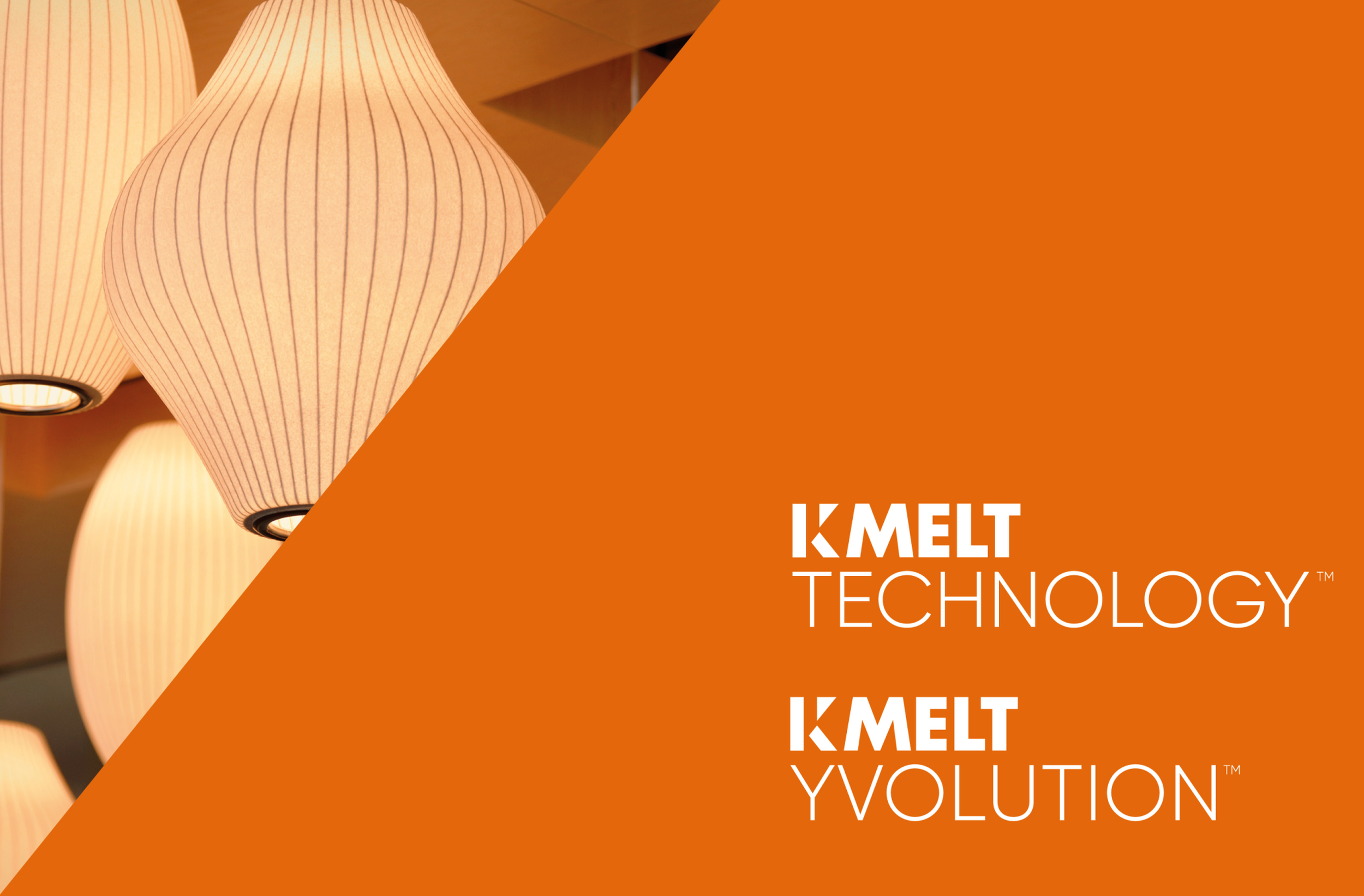
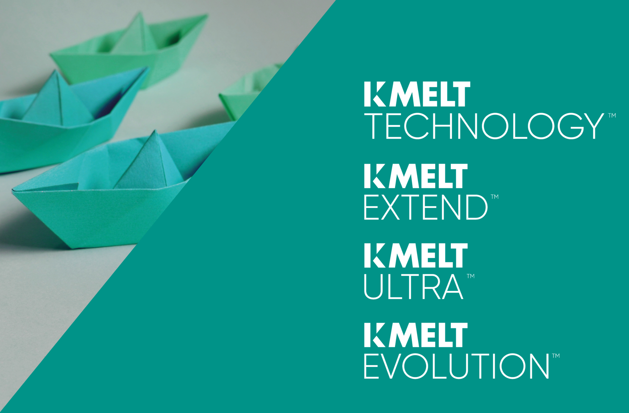
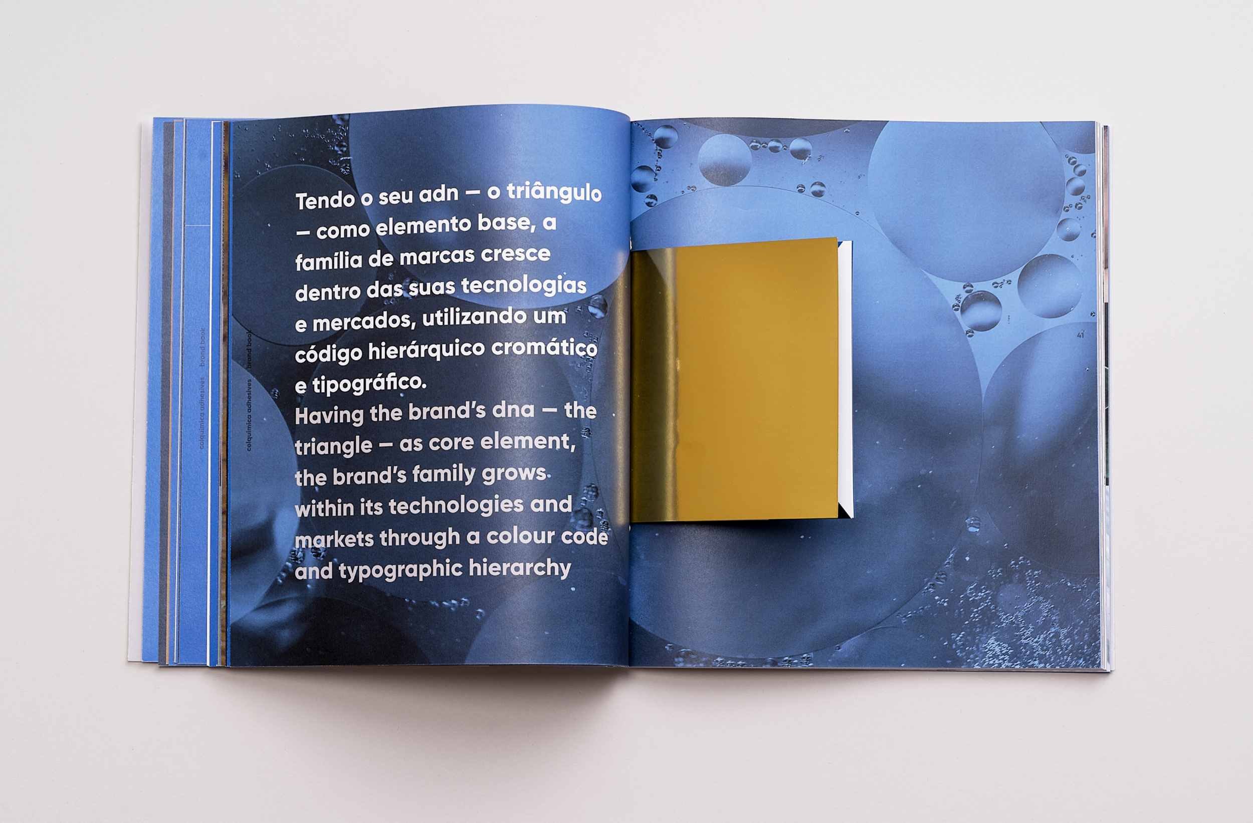
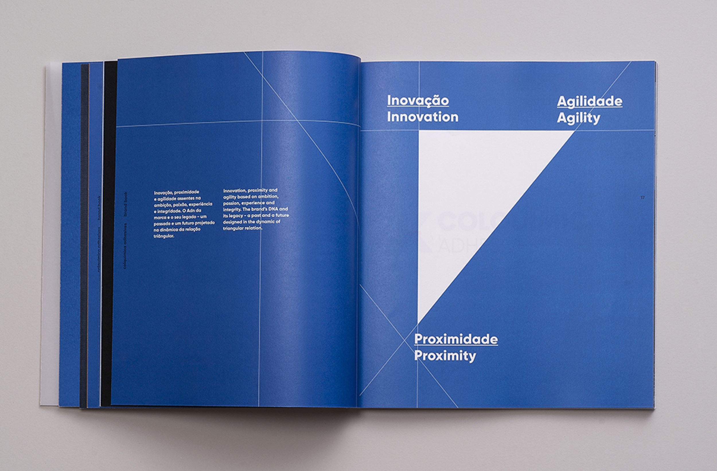
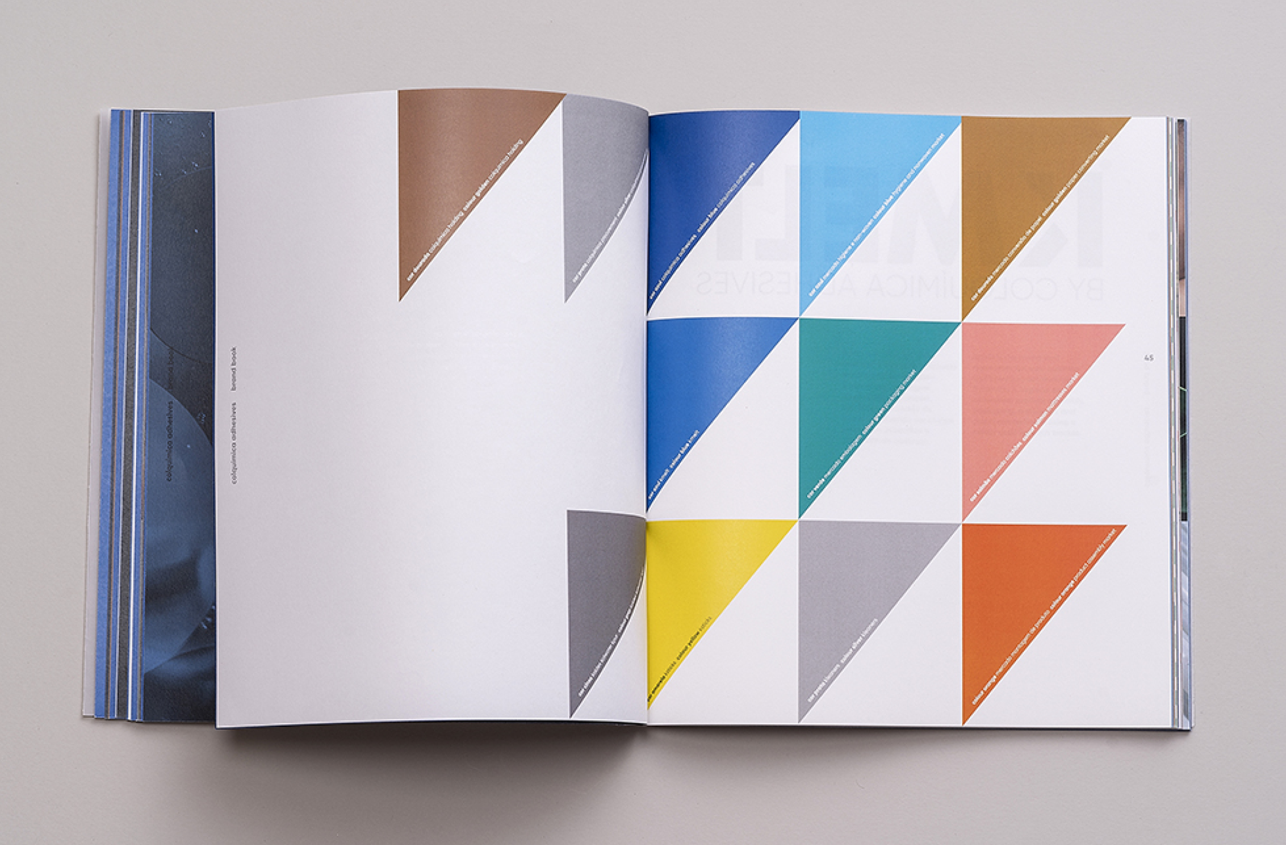
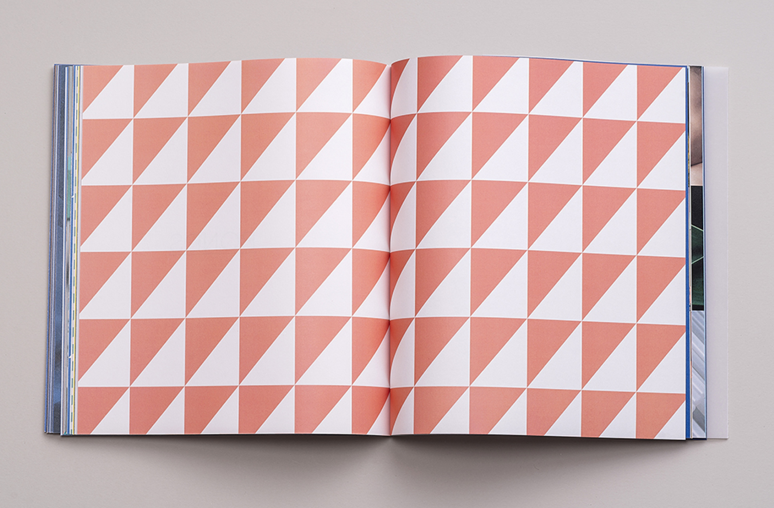
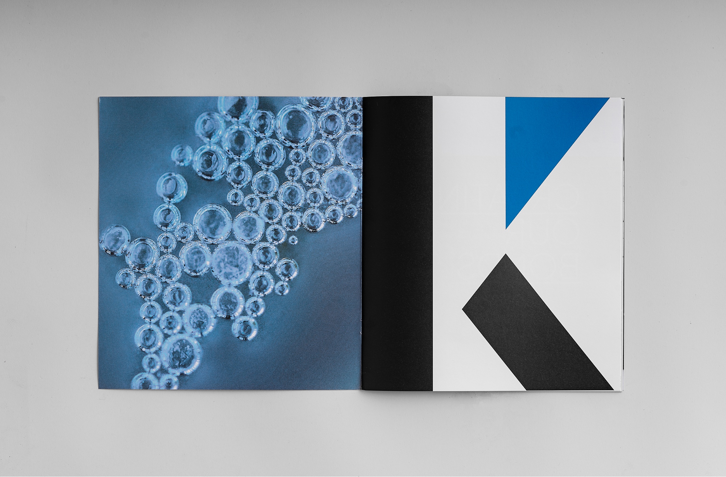
Building the future with solid bases. A brand that connects, creates empathy, that is global and multicultural. The brand’s DNA - the “triangle” - was the core element and the starting point to allow the family of brands to grow and expand through a new colour code and typographic hierarchy. The visual universe and a consistent verbal communication was also very important to reinforce the global commitment to the brand goals, being the main moto “Creating bonds”.


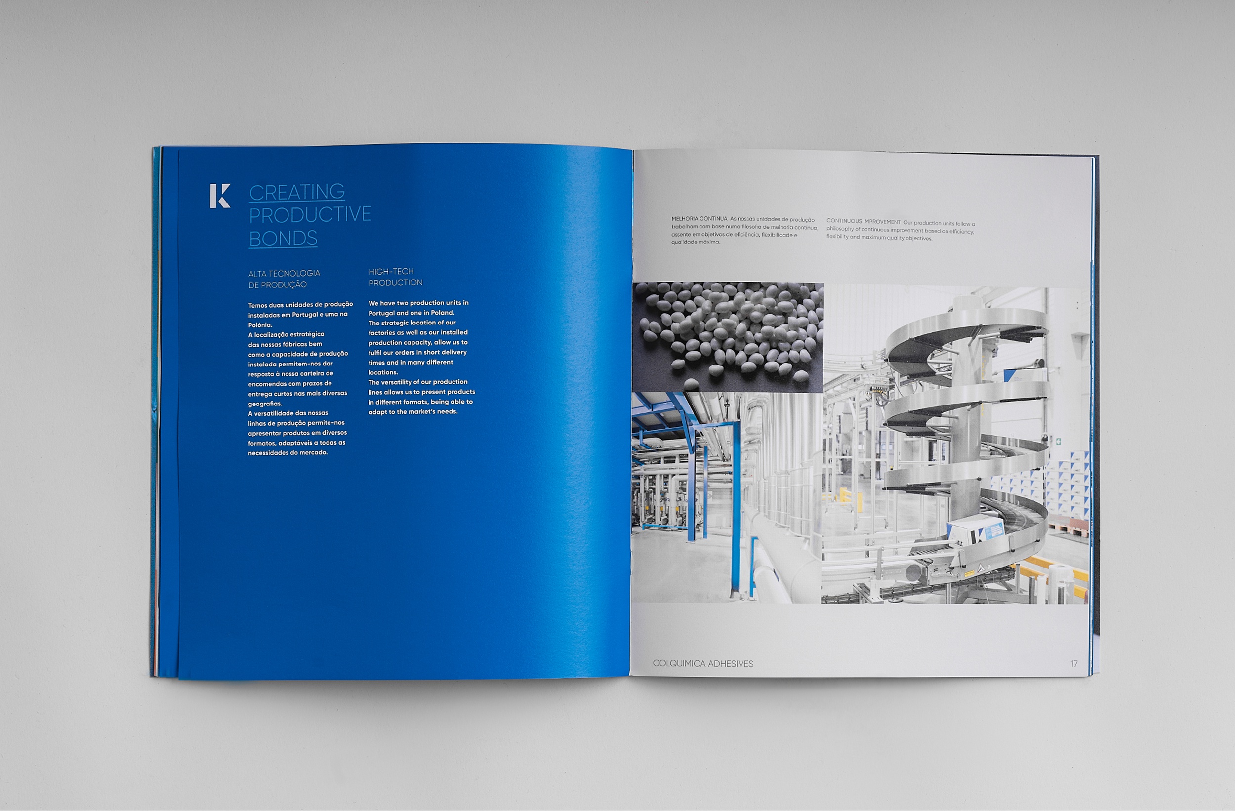
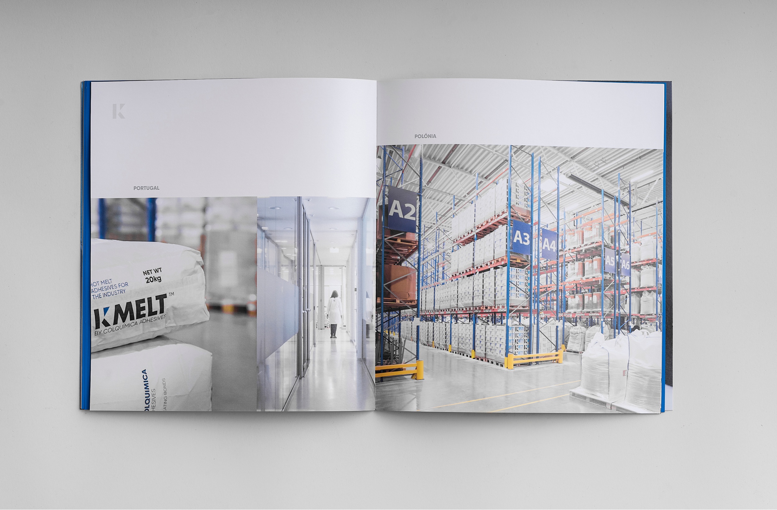
The rebranding process extended to all institutional materials. The brand architecture, study of brand anatomy (for the creation of new brands), stationery, website, packaging, corporate presentations, product catalogs, merchandising, spaces, among others, allow the brand to build and establish its persona, gaining strength and meaning.
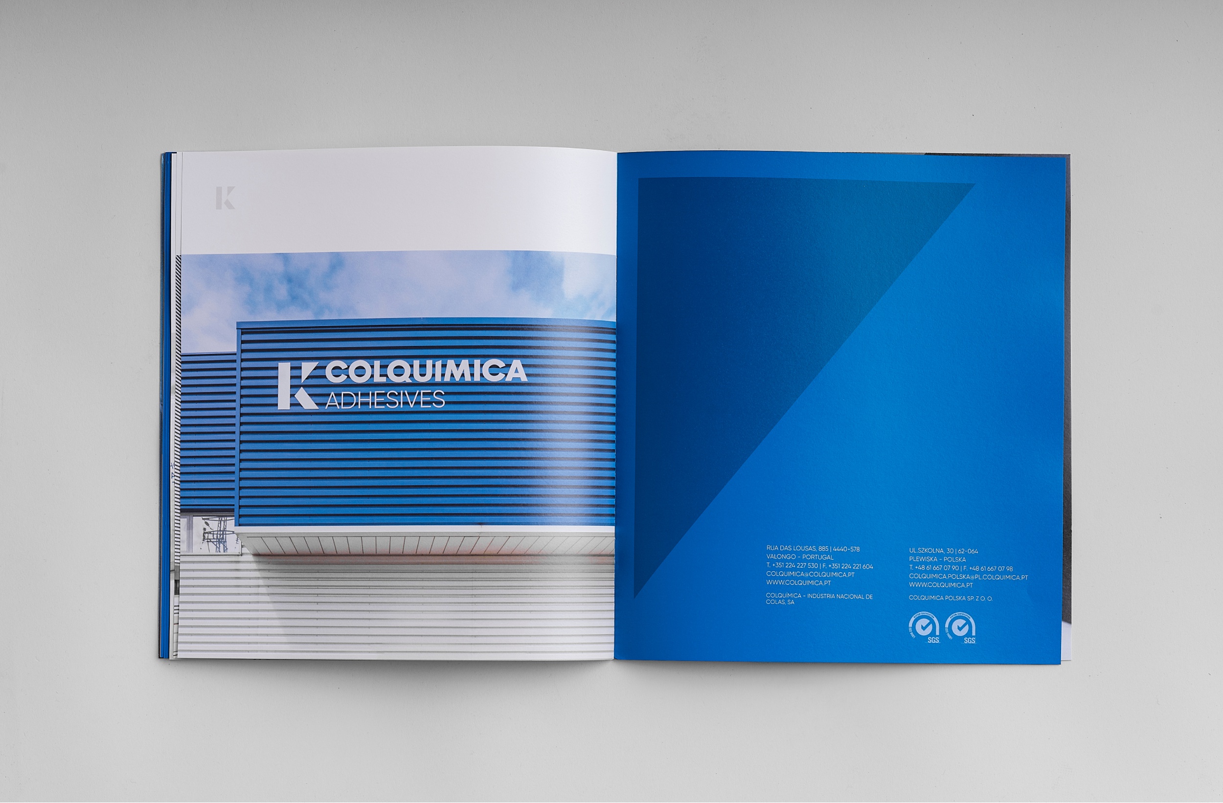
The 'K' stands out as the main element in the boxes, as well as the signature. The website was designed to provide an intuitive usability experience that is close to the consumer, with a strong emphasis on corporate language and content organized according to the brand spirit.

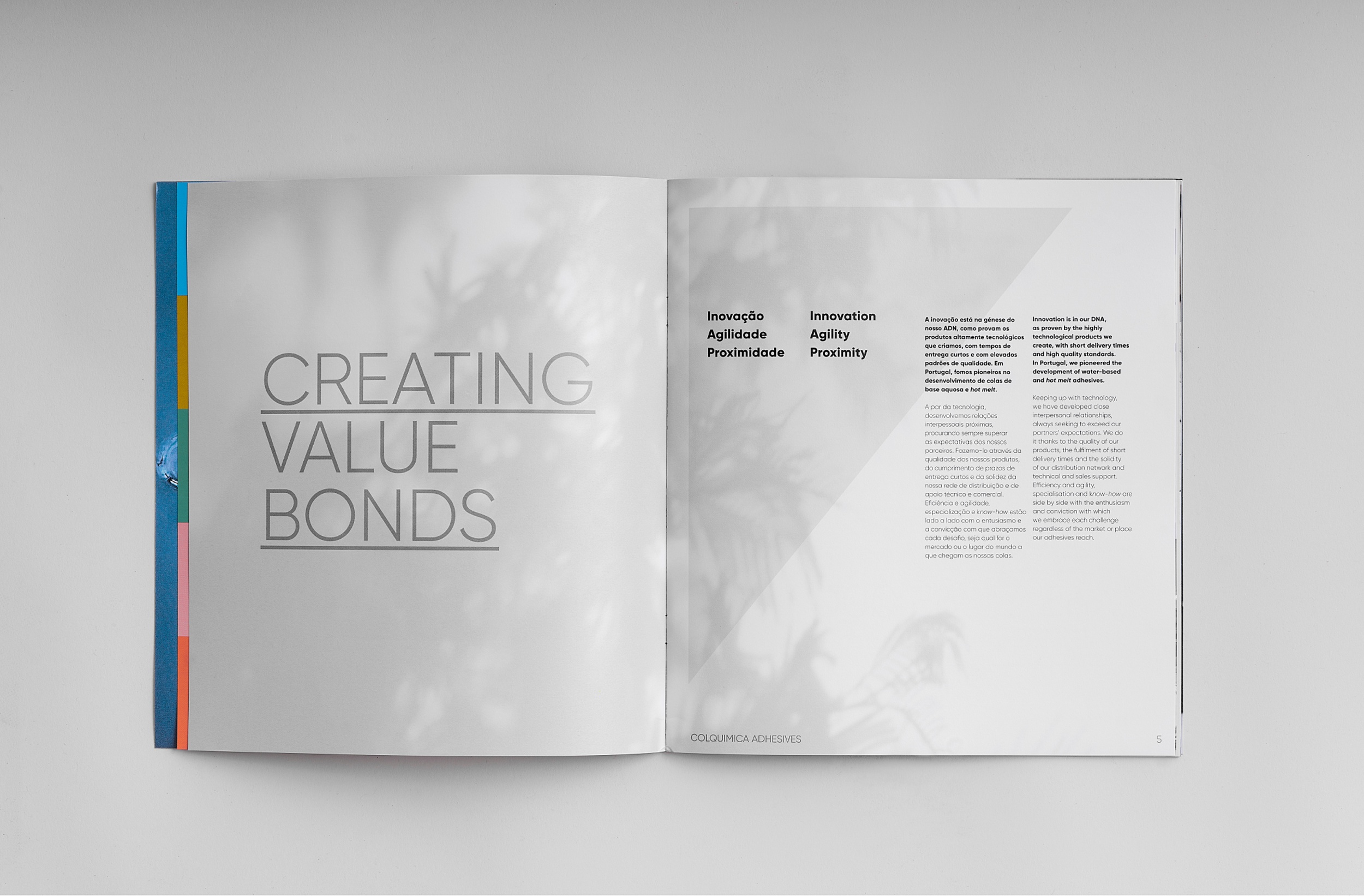
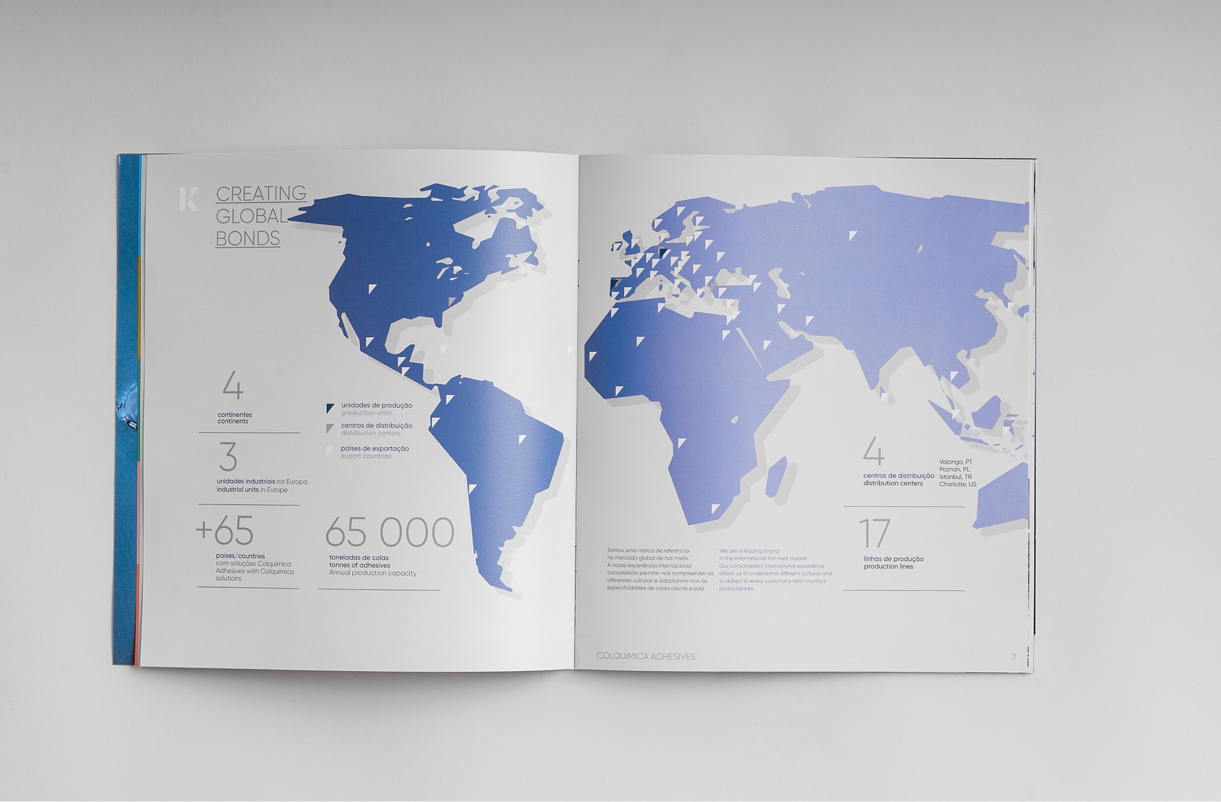
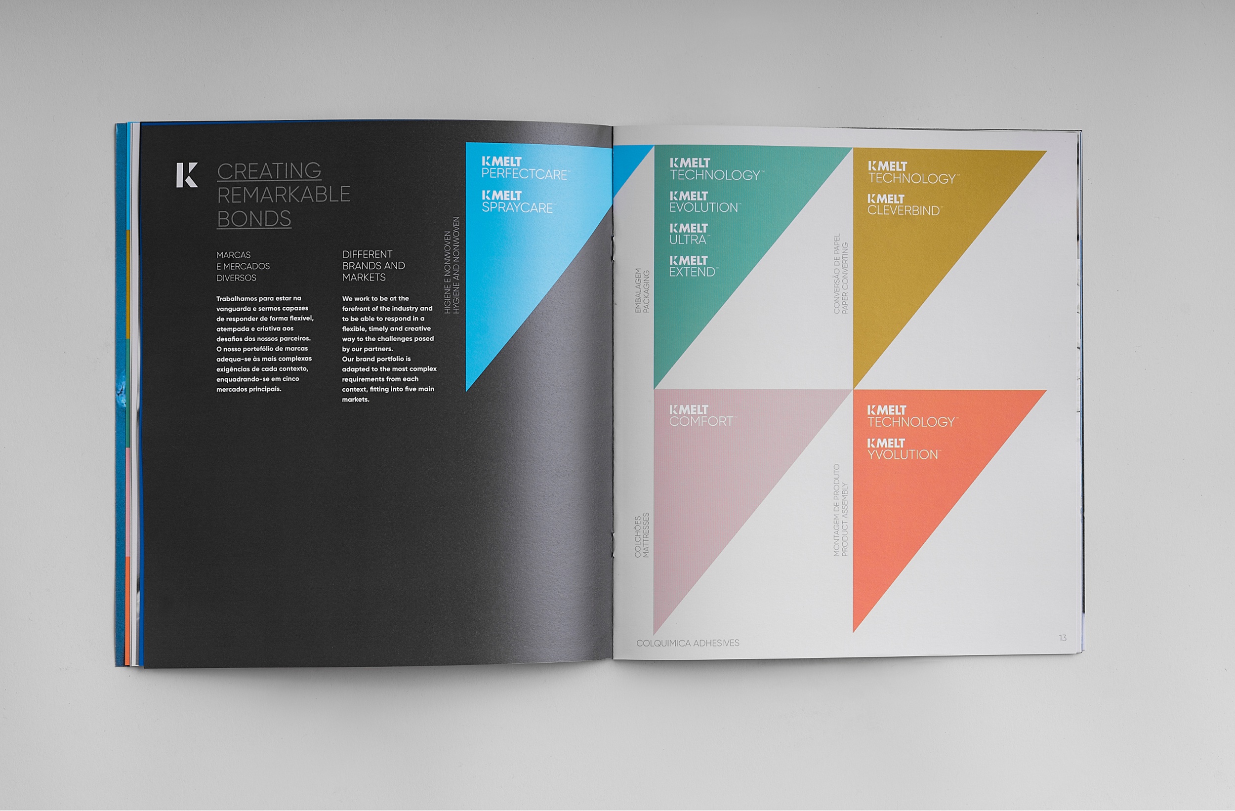


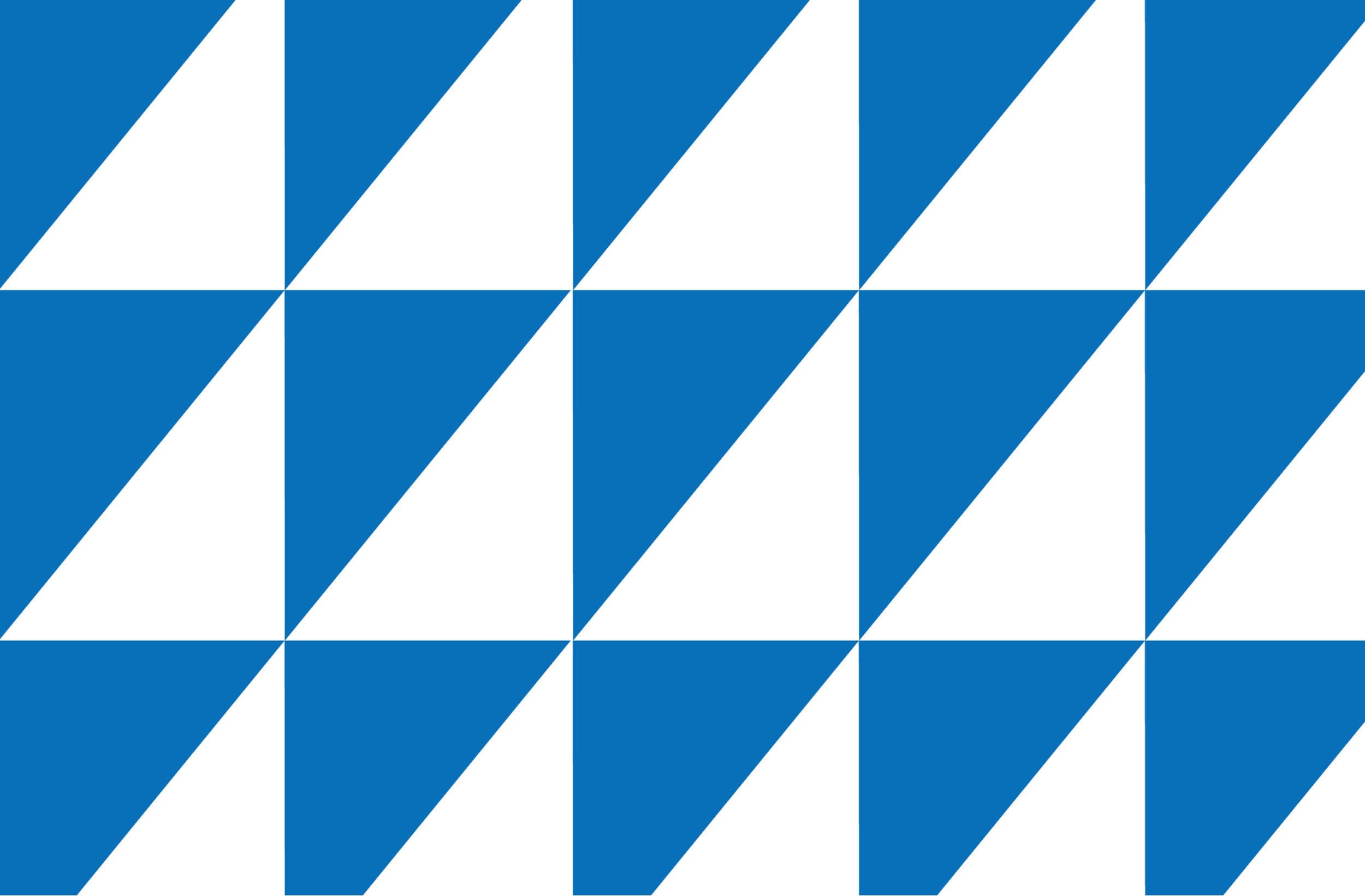


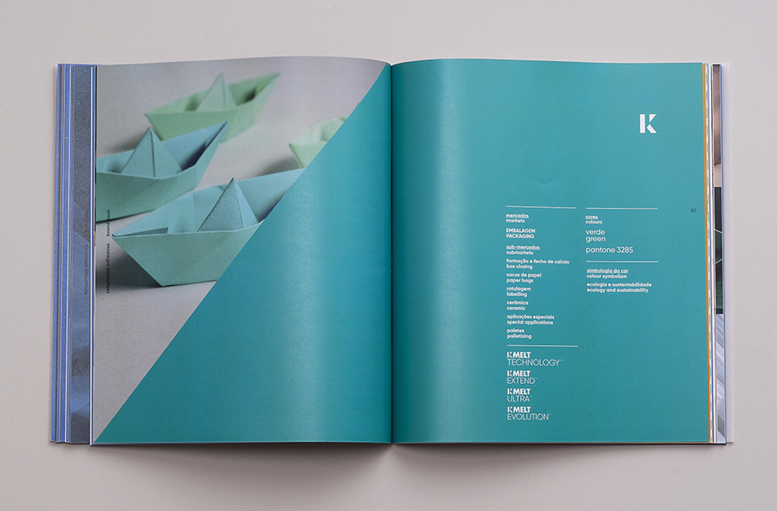
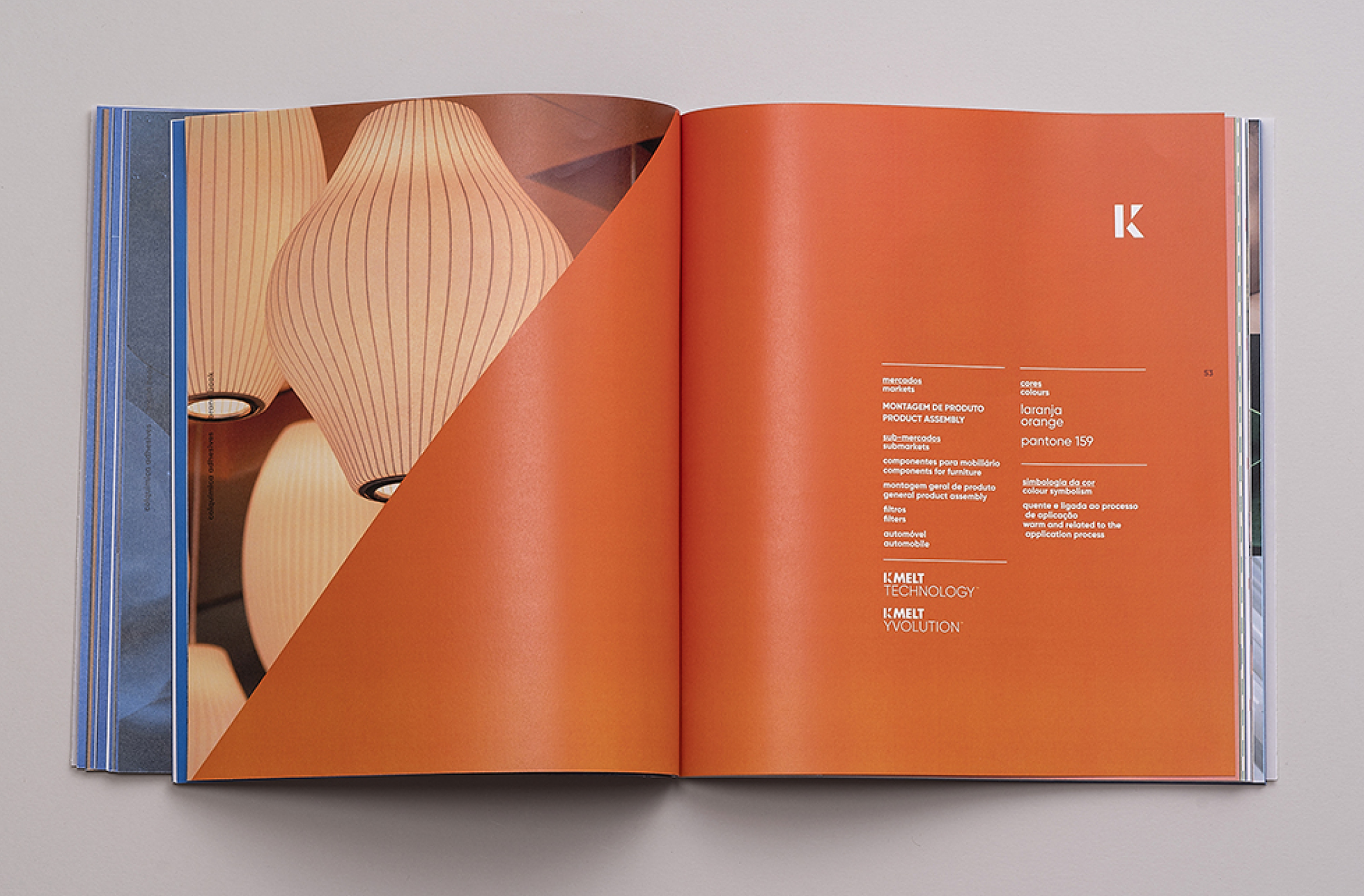
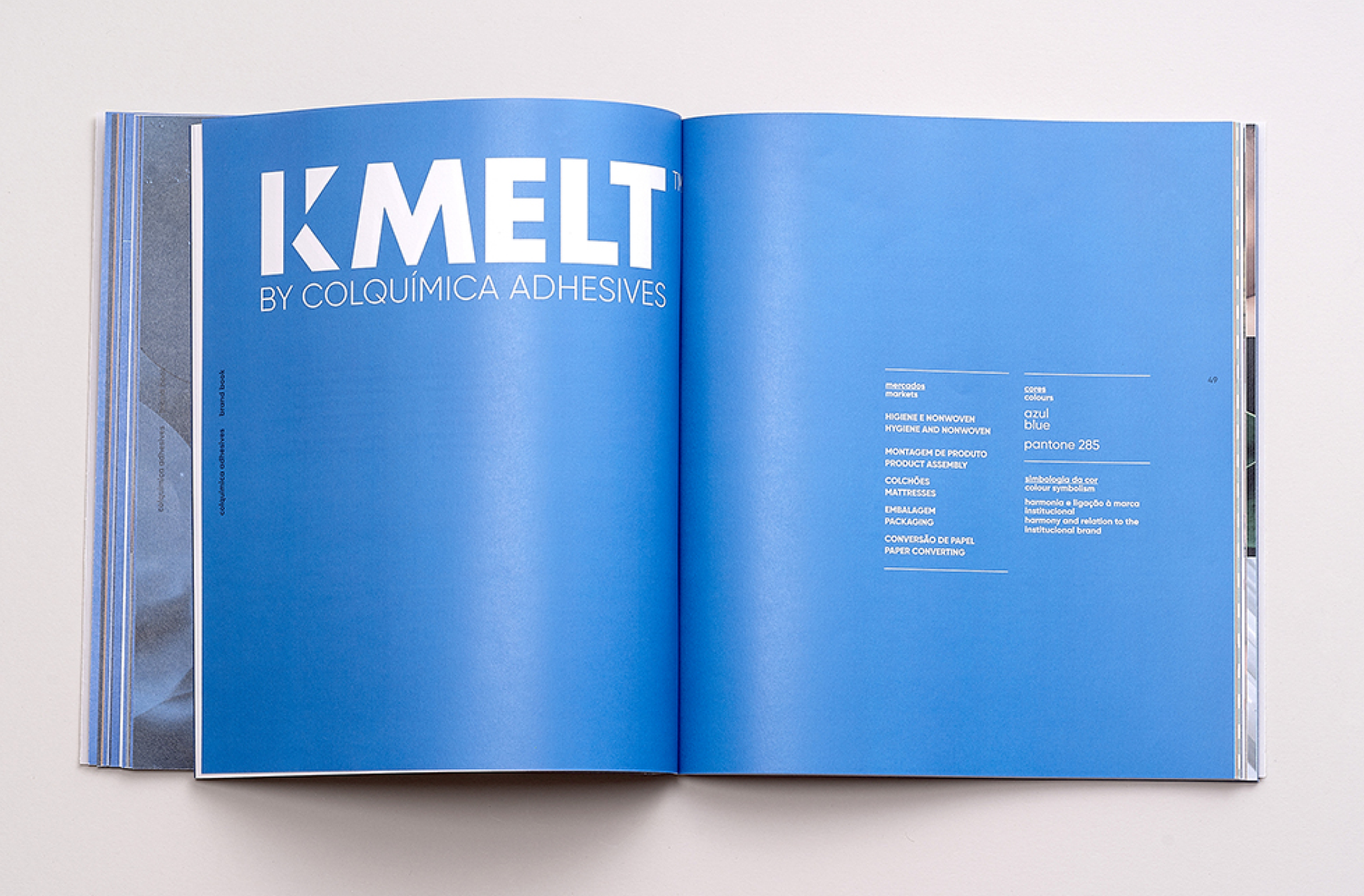
The exploration of the visual dynamics created through color is a constant feature in all applications. It acts as an organizational code for the brand and characterizes the diverse universe of the organization.